Sunday, September 30, 2012

Is one in 10,000 good enough?

Great White Copy paper
According to this box of photocopy paper it is 99.99% jam-free. (No word on the peanut butter content.)
Great White Copy paper - Detail
That figure, 99.99%, means that one sheet in 10,000, or one in every two boxes, will jam. Is that a good level of quality? Would one in 300,000 be better? Would that level of failure be acceptable. Most people would say yes. One in 300,000 is pretty darn good. Not much to complain about there.

Of course, once I give you the context then the picture changes. Every year there are over 300,000 takeoffs and landing at YVR, Vancouver International Airport. So one failure there has a pretty serious impact.

And that is the critical point about any quality statistic. Without context, the statistic is pretty useless.

Labels: , ,

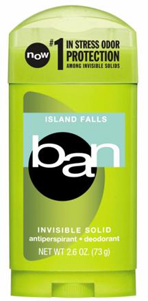
What happened to Ban?

Source: http://talkingmakeup.com/tag/ban/

At one time Ban was a really big player in the deodorant market. (I've been a Ban user for years.)

Yesterday I was at Safeway and was looking for some Ban. None in stock, and not even a place for it on the shelf. I wonder if the brand is about to die in North America. There were about 20 different varieties of Axe on the shelf.

I'll keep looking. I may find Ban on the shelf at Shoppers Drug Mart, which is where I bought it last time.

Labels: , , ,

Saturday, September 29, 2012

They've ignored their math lessons

Receipts from Safeway and Real Canadian Superstore
My grocery shopping habits are driven by convenience. If I'm close to Safeway, I shop at Safeway, but I happen to be near a Real Canadian Superstore, I'll shop there.

Real Canadian Superstore tends to be a bit cheaper, but the service is better at Safeway. But regardless of the store's model, people at both companies have decided to ignore the lessons they learned in math class.
50% discount at Safeway


50% discount at Real Canadian Superstore

The rules of rounding say that when the figure is 5 of above you round up, and when it is 4 or below you found down. But when  the amount is 5, both of these stores are rounding down.

When you give a 50% discount on a product with a price that ends in an odd number ($3.99) there is a 1/2 cent left over. (Half of $3.99 is $1.995) Who does that 1/2 cent belong to? It should belong to the customer. This means that the customer should pay $1.99, not $2:00. While it may seem trivial, those 1/2 cents add up.

There are 107 Superstores across Canada. If each store sells 200 50% items each day those 1/2 cents could add up to 100 cents. So, $107 per day for the 107 stores. If the stores are open 360 days a year that is close to $40,000 per year. For a firm with sales in the billions, that is not much of a price to pay to keep the Competition Bureau happy, and avoid pissing off customers who actually pay attention to their receipts.

Labels: , ,

Friday, September 28, 2012

Making my coffee in the dark

Five working lights and one dead light at Starbucks
Retail stores are filled with lights. As I observed previously, a store like Pottery Barn Kids has hundreds of lights. But this photograph, taken in a Starbucks location in Kelowna, shows a store with only a few dozen lights. But they still have about 10% of them out of action.

I know it may no seem like a big deal, but it does bug me and I think that it shows a  lack of attention to detail, and care about the appearance of the store. There is no way that the management would tolerate a similar failure rate in any other area of store operations, so why lights?

I guess it is probably because changing the dead lights requires dragging out the ladder, disrupting the traffic flow of the store, and showering customers with dust.

Much better to leave the dead lights until the staff are operating in the dark.

Two lights, one working and one dead at Starbucks

Labels: , ,

Wednesday, September 26, 2012

I want my quarter back!

Shopping Cart at Safeway
It has been quite a few years since grocery stores instituted deposits on their shopping carts. Once you insert your coin in the slot the "key" with the red plastic collar pops out of the socket and you can wheel your cart away. When you return the cart you insert the "key" of the cart in front into the slot opposite your captive coin and the coin is released.

Well, that is the theory. It all depends on the key with the red collar being on the cart in front when you return your cart. And what do I find at my local Safeway?

Shopping cart without a "Key" at Safeway
No "key" with a red collar. This means that I can get my quarter back. It is only a quarter, but Safeway either needs to have a system that works, or abandon it altogether. I know, I'm petty. But retail is a million details, and you either get them right, or suffer the consequences from disgruntled customers.

Labels: , ,

Tuesday, September 25, 2012

Well, in fact I was born yesterday

Day-old baked goods at The Bike Shop Cafe
I like the little things that retailers do right. In this case the day-old baked goods are identified, not with a sign that says "Day-Old", but with a "Born Yesterday" sign. Simple and clever.

Retail is a business of a million tiny details. When they're right, most customers don't even notice. But if you get them wrong you'll never hear the end of it.

Labels: , ,

Monday, September 24, 2012

Why should I care about Hermiston?

Cardboard container on skid at The Real Canadian Superstore
Evidently Hermiston, Oregon is a hotbed of melon farming. But given the fact that Eastern Oregon is a pretty dry place, and the melon farming is dependant on irrigation from the Columbia River, this does not make a lot of sense.

These melons are basically a really expensive and complicated way to bring Canadian water back to Canada.

Are melons from Hermiston any better than melons from anywhere else? Do they taste better, or are they just cheaper? Either way, they seem to have a nice share of the British Columbia melon market in September.

Labels: , , , ,

Sunday, September 23, 2012

Radio, now a service of Proctor and Gamble

JR Country billboard in Vancouver
I saw this billboard and thought, "I recognize that colour scheme".

Tide bottle with it's distinctive yellow and orange logo
Obviously, the radio station must think that the Tide colour scheme resonates with their listeners. Easy to do if you are a radio stations that is appealing to the broad mass of the population. The Tide logo, and colour scheme, is among the best know packaging designs in North America.

This does raise the issue of how much protection Tide packaging design has under intellectual property laws. Despite the history of "soap operas", I don't think that anyone will think that P&G has a equity stake in JR fm.

Labels: , , , , ,

Saturday, September 22, 2012

Did you bring protection? (From a lawsuit?)

Advertisement for Harley Davidson safety gear at TRU
Women are poorly represented in most construction trades. Carpenters, plumbers, electricians, pipe fitters etc. tend to be male. In the early days of these professions, physical strength was one of the key requirements to do the job.

These days brains are just as, if not more, important for tradespeople. Trade schools and industry associations all say that they doing everything they can to encourage more women to enter the trades. And I actually do see a few women in safety boots around the Trades and Technology (T&T) building at Thompson Rivers University.

But then I see this advertisement in the men's room in the T&T building and I think that maybe it is all just window dressing. Perhaps women's role in the trades is merely to be whistled at by the guy on the scaffolding at the construction site.

I am amazed that the university permits this advertisement on campus, and that campus women's groups have not protested and had it removed. But I guess that women taking classes in the T&T building don't spend a lot of time in the men's room.

Labels: , , , , ,

They're hedgehogs!


Cover on "Bob Saves the Porcupines"
I hate children's books that can't get basic science right. And it happens far too often.

Detail of book cover
Bob the Builder is produced in the United Kingdom. The UK is blessed with an abundance of animal species, however porcupines are not one of them. For some bizarre reason the North American edition of this book is entitled "Bob Saves the Porcupines". The problem is that these cute little creatures are not porcupines, they're hedgehogs. (And in the UK the book is entitled "Bob Saves the Hedgehogs".)

UK Cover for "Bob Saves the Hedgehogs"

I recognize that the publishers are trying to extract as much revenue as possible from their investment, but surely that should not be at the expense of confusing the children.


Labels: , , , ,

Friday, September 21, 2012

I can auction anything? Really?

ebosa.com sign in convenience store window
You see these signs around Vancouver, often in the windows of convenience stores and Internet cafes.

Despite the fact that signs seemed to be ubiquitous, I didn't know anything about the firm, so I checked out the website.

How have these relics managed to stay alive all of these years? The following is a quote form the "History" section of the "About Us" page.

HISTORY
ebosa” started it's roots in British Columbia, Canada during September 2004. Throughout 2005, we will market and upgrade the site with many useful features as our member base grows. Currently “ebosa” receives an average of over 10,000 visitors per day from Canada, USA, and from other areas around the world. “ebosa” is rapidly growing with more users every day. This is partly due to the service that “ebosa” provides, complimented with the local and worldwide advertising done by ebosa and it's members.


I'll make sure to keep an eye on those 2005 site upgrades. I'm positive they will be great.

And that fact that I can auction anything is a real attraction. It is tough to find a way to get the best price for used diapers. Or perhaps I can't really auction "anything".

But even if I can auction anything, not many people seem to be bothering to use the site. I found only one auction for a bicycle, and this is a category that returned 17,388 listings on eBay.

Oh well, everything is not lost, at least the classifieds are free.

Labels: ,

Thursday, September 20, 2012

Space for sale

Brochure for for-profit firms at the Merritt visitor's centre (Yet another crappy photo by yours truly)
Whenever I travel I am amazed at the volume of free information I find at the tourist information centres. Sometimes the information is useful, in other cases I find brochures trying to persuade me to visit rather dubious attractions. (The largest ball of the string in the tri-county area!)

So, how do those brochures get there and what does it cost to display them? I found this sign on the wall at the Merritt Visitor's Centre.

Brochure Racking sign
As is the case with so many ares f marketing, there are volume discounts available. The longer the time you have your brochures in the visitors centre, the cheaper it is per month.
Detail of Brochure Racking pricing
My questions is, how many companies who would like to have their brochures here actually visit this visitors centre? The answer may surprise you. It is the second busiest in British Columbia. Only the centre at the Vancouver airport serves more visitors. So, having the sign on the wall actually makes quite a bit of sense.

Labels: , , ,

Wednesday, September 19, 2012

I wish I had a photograph

Car eastbound on the Transcanada Highway (Two minutes after)
Two minutes before I took the photo we passed this car. If you look carefully your will notice the the car is a loaner from Craftman Collision.
Craftsman Collision sticker on the side of loaner vehicle
What do I wish I had a photograph of? The driver of this car, a loaner vehicle from an autobody shop. texting on her telephone while driving along at 90 km per hour.

I made me wonder how she ended up in a loaner car, and especially who caused the accident. And of course the obvious question, can you get a loaner vehicle when you crash your loaner vehicle?

Labels:

Tuesday, September 18, 2012

Green means stop (At least at this restaurant)

No smoking sign at A&W
First of all, my apologies for the quality of the photograph. Apart from the increasingly questionable quality of photos from my phone, it is a blow up of a snippet of a photograph that I took over the weekend. When you are taking photos on the sly, you often don't get a chance to get things set up properly.

I saw this sign in an A&W I was in on Friday night. I think that this sign is telling me that smoking is not permitted. But, if that is the case why are the circle and line in green. That is the colour that tells me that something is permitted. But the line through the middle of the circle tells me that it is not permitted.

I didn't see anyone smoking, but I'm sure that I'm not the only one who is confused.

Labels: , , , ,

Monday, September 17, 2012

Right sign, wrong colour

Highway sign on the road from Merritt to Kamloops
In British Columbia, as in many other places around the world, summer is the time when the roads get ripped up for maintenance. (It makes sense, that is when all of the tourist are out hoping to use the roads.)

Highway sign detail
What problem do I have with this sign? The colour. Not the colour of the sign. The blue and yellow are used by the British Columbia government to identify government services, and in this case, a piece of road work paid by the government. (As if road work in the province might be paid for by someone else? Maybe the state of North Carolina will do it, just on a whim.)

I have a problem with the red "COMPLETED" banner. That is exactly what I would expect to see, red background and all capitals, if the project was cancelled. I reminds me of the banners you see across the sign at the theatre box office when the performance is cancelled due to illness etc.

Red will certainly get attention, but the cautionary note that is associated with red does not really say completed to me.

Labels: , , , ,

Sunday, September 16, 2012

A move for the better

Tall Tales Books (http://talltalesbooks.ca/) has moved. This is the really, "The Little Book Store That Could".

I previously wrote about the store's "Hero Society". This is an innovative subscription service where customer can pay $10.00 per month an build up a credit balance with the store. The funds can be redeemed at any time. Most book stores do a disproportionate share of their sales at Christmas time and these regular payments really help the store to manage its cash flow. My daughter and I have both signed up and I use my saving to buy books for her Christmas and birthday presents.

It initially opened on Fort Street in downtown Victoria, but after three years has moved out to Oak Bay. It is sharing a space with The Story Studio (http://www.storystudio.ca/). (The Story Studio is dedicated to coaching youth through the writing process, enabling them to experience success as authors and strengthen their ability to write in their own voice.)

Moving from a downtown location with limited parking to more driver and child-friendly environs of Oak Bay makes a lot of sense.

It just goes to show that the old real estate maxim really is true.

What are the three most important things in real estate? "Location, Location, Location".

Labels: , , ,

How important is your domain name?

I was talking to a friend of mine who runs a small speciality retail store. In his niche market he is a doing pretty well. He feels that one of the reasons for his success is his choice of name, for both his store and the domain.

Let's say his business sell backpacks (it doesn't) and he has chosen as his store's name "Backpack Barn". (he didn't) Well, the name of the store matches the domain (backpackbarn.com), and the first word in the domain is what you will find in the store.

Is there any benefit is calling it"Jim's Backpack Barn"Apart from a bit of vanity, not really. The customer is looking for backpacks, not Jim.

The name of the commodity that he is specializing is in both his store name and his domain name As a result he has three of the top four listings when you search for "backpacks" and the city he is located in.

Does it have an effect on his business? About 1/3 of his sales come from people who found him via Google.

If he'd given the store a more exotic name, "The South Col", "Coasts and Couloirs", or "Sea to Summit", he would probably not be getting the same results in Google. Just goes to show how critical a good Google result in particular, and search engine optimization overall have become for an B2C business.

Labels: , , , ,

Wednesday, September 12, 2012

Needlessly confusing

Sign in a United Church parking lot
I've moved, and as a result I had to find a new pre-school for my daughter. Looking for a pre-school with a spare space at the beginning of the school year is bit of a "needle in the haystack" adventure.

But, we found a spot at a Montessori school that rents space from a United church. Parents dropping off kids can use the church's parking lot. The church service and Montessori class schedules don't offer much overlap.

I saw this sign and it took me a while to decide if it was merely confusing, or if it went the whole hog and was really confusing. I decided it was really confusing.

The public are to park on the right and the staff are to park on the left. But the word "public" is on the left and the word "staff is on the right. It would make more sense if the wording was done like this.

Suggestion  for Parking Sign
Now, does that not make more sense? Certainly less confusing. Oh well, we can but hope that someone will grow a brain and design some signs that are a bit more logical.

Labels: ,

Tuesday, September 11, 2012

Never underestimate the power of cute

U-Haul Trailer
The U-Haul company has been in business since 1945, and for many people it is synonymous with moving. The firm started out renting trailers for one-way moves, and has since added a variety of other options including trucks.

I saw this cute little trailer in Kelowna over the weekend. Small and aerodynamic, it could probably be towed by just about any vehicle.
U-Haul Trailer
I think the most important feature of this trailer it that it is so cute. Never underestimate the power of cute, and in this case cute also means aerodynamic. But, does the shape make packing harder? Would a basic box be more functional? How does U-Haul establish the balance between aerodynamic shape and usability? Or maybe cute is all you need?

Labels: , , ,

Monday, September 10, 2012

Nice plaque, but where is the tree?

Plaque on Knox Mountain, Kelowna
Trees are important in British Columbia. Just think back to Monty Python's Lumberjack Song, Michael Palin sings about them floating down, "the mighty rivers of British Columbia".

So, the "6 Billionth Tree" is not an unimportant milestone in forestry in the province. A lovely plaque, in a location with a great view.
View of the Peachland fire from Knox Mountain, Kelowna
We have a plaque, a lovely view, (Yesterday affected by a fire down the lake in Peachland), but what about the tree?
Plaque, but no tree on Knox Mountain
It appears that someone has either cut down or moved the tree. There does appear to be a small hollow just past the plaque where a tree might have stood at one time.

It just looks a bit pathetic.

Labels: , , ,

Sunday, September 9, 2012

Great sign, horrible building

Sign above the door at Pacific Industrial Solutions
I was riding around Kelowna over the weekend and saw this sign on my way to Knox Mountain. (A great little climb that is only 2 kilometres from the start of my ride.)

The letters are made up of machine part, tools, and components. (The "U" in "solutions" is a C-clamp)

I though that this was a very clever piece of branding and show a lot of imagination. But the problem is that the building the firm is located in looks a bit decrepit.
Pacific Industrial Solutions building in Kelowna, BC
Now I know that I should not judge a book by its cover, but I would hope the the imagination and creativity shown in the sign would carry over to all aspects of the firm's operations. I'll have to drop by when the workshop is open to see if the inside shows the same level of creativity.

Labels: , , , ,

Wednesday, September 5, 2012

They'll never notice, until they do

Track lighting Pottery Barn Kids
Lighting is the bane of retailers. It is a huge cost and requires constant maintenance. I saw this track in a Pottery Barn Kids location in Vancouver. And yes, the three lights with the black trim are all dead.

I have a few problems with this.
  1. Dead light bubs make it harder to see in the store. If I can't see I can't make my decision and decide to purchase.
  2. Why is the store mixing two different types of fixtures, all white and white with black trim, on the same track? It just looks messy.
  3. If the lights burn out faster in the white and black fixtures, why do you still use them? It makes the store look uncared for and also drives up light bulb costs.
These are all petty pedantic details, but the reality is that is what retail is all about. And if you can't, or won't, pay attention to the details then you won't stay in business.

Labels: , , , ,

Tuesday, September 4, 2012

A new type of plastic bottle

Canola Oil container at The Real Canadian Superstore (Loblaws)
Last week I was shopping at The Real Canadian Superstore, a big-box supercentre retailer owned by Loblaws. These stores sell everything from groceries to children's clothing. (Statistics I saw a few years ago listed the firm as the third-largest retailer of children's clothing in Canada.)

And, the onslaught of Walmart notwithstanding, Loblaws remains the largest food retailer in Canada. As a big retailer, Loblaws can exert a large amount of pressure on its suppliers. Everything is done to drive down costs and increase revenue.

In the past, large bottles like this had a moulded-in handle made of the same PETE as the bottle's body. This bottle uses a different type of plastic, and because it is not hollow and part of the bottle body, it can be stronger and more rigid. It makes me wonder what problem this new handle is solving. How does this design have a positive effect on Loblaw's bottom line?

Labels: , , , ,

Monday, September 3, 2012

Nothing like a frog

WrapShield labelling
WrapShield makes adhesive "breathable permeable self-adhering weather resistant air barrier" building wrap. I saw this on the side of the primary school near Vancouver.

I have done a fair bit of renovating and work on my house over the years, but I had not come across this product before. I'm sure that given Vancouver's wet climate, it is a good choice. The interesting thing products is the use of a frog to indicate that the products is both breathable and weather resistant.

Does this "froggy" message carry the same meaning everywhere? Probably yes. Apart from the polar regions and some deserts, frogs have very wide distribution. So pretty much everyone has probably seen a frog at some time in their life.

Labels: , ,

Sunday, September 2, 2012

A beer-power motorcycle

Suzuki motorcuycle with Corona stickers
Corona sticker
I know, I'm pedantic and petty. (However, I do come by it naturally and I think that it is a genetic problem as my siblings are similarly affected.)

I saw this motorcycle near Vancouver yesterday. The Corona sticker is a relica of the race livery that the sponsored racers have on their motorcycles. (And is available on-line at http://www.bikehps.com/acatalog/Suzuki__Graphics_Kits.html)

But does it not strike you as a bit odd that in these days of heightened concern about drinking and driving that a motorcycle racing team would be sponsored by a brewery? The demographics are perfect, young men drink beer and ride motorcycles. The problem arises when they do both succession.

Labels: , , , , ,