Monday, October 29, 2012

A great product that I recommend

I ride my bicycle a lot, and often ride alone. Like most cyclists with a family, they worry about me.

A few years ago I happened upon this product in a small advertisement in the back pages of Bicycing magazine, and I ordered one.

RoadID Brochure with endorsements
RoadID Brochure with Styles
While wearing my RoadID won't prevent an accident, it does ease my wife's mind a bit. As I recently moved I needed to update the name plate on my RoadID. It now list my name, blood type and healthcare card number, along with my address and three contacts and their telephone numbers. Now I wear both the wrist and ankle versions while riding. If I can't speak for myself, I'd like to have someone do it for me.

Do I think this is a good product? Absolutely. I bought a gift certificate for my brother for his birthday. He rides a lot more than I do, and usually rides alone.


Labels: , , ,

Sunday, October 28, 2012

Never underestimate the power of cute

Many times I've told my marketing students to never underestimate the power of cute. The Smart car, the VW Beetle, and "Hello Kitty" all succeed to some degree based on their cuteness. So, what did I find when I was unpacking groceries last week?
Heinz "Hello Kitty" Pasta
A tin of "Hello Kitty" pasta. I have no idea what "Hello Kitty", a licensed character from Japan and flagrant rip-off of Dick Bruna's "Miffy", has to do with pasta. I don't associate pasta, or even whole grain pasta, with Japan. But my daughter fell for this hook, line and sinker, and my wife was unable to dissuade her. (It was on sale, and the price was therefore somewhat in line with competitive products.)

So we had "Hello Kitty" pasta at our house. Was it repulsive? No, just bland and average, which is what I expect of food aimed at children. The fat and sodium contents were not too outrageous. But I suspect that most people buying this pasta will be doing so regardless of the ingredient label. The seal of approval from Sanrio is all that is required to get these tins flying of the shelves.

Labels: , , , , ,

Saturday, October 27, 2012

I hoped their customers are not this stupid

Instructions with Planet Bike "Red Zeppelin" CO2 Inflator
I recently bought a Planet Bike "Red Zeppelin" CO2 inflator to carry on my road bike rides. I don't get flats very often, and when I'm on my own I don't really care how long it takes to pump up the tyres. But I have started doing Sunday morning rides with a group, and I don't know if I should really try the group member's patience with my tiny hand pump. Very light and small, but about 200 strokes to fill up my tyre.

As I usually do, I read the instructions for the inflator. (I know, a real oddity among customers.) I found this caution at the bottom.

Caution on Instructions with Planet Bike "Red Zeppelin" CO2 Inflator
I hope their customers are not that stupid. But as Planet Bike is a US-based company they have probably learned never to underestimate the stupidity of the consumer, or the wounded consumer's willingness to sue.

Labels: , ,

Thursday, October 25, 2012

It's only a difference of 5 grams, but please try to get it right


The Upstand – the lightweight, compact, detachable, portable bike stand Stand your bike up anywhere, anytime.
Upstand banner ad from http://www.roadbikerider.com

I saw this ad on the roadbikerider.com website and thought that this looked like a really good idea. Too often I have to lean my bike against store windows, trees etc. So I clicked on the advertisement and was connected to the firm's website, only to be disappointed.

Source: http://upstandingbicycle.com/

Source: http://upstandingbicycle.com/

Although the banner advertisement says that the stand weighs 35 grams, the website says that it weighs 40 grams. I know the difference is only 5 grams, but that is about 15% more. If you are going to quote weights to obsessive compulsive cyclists, and make a big deal about the product's weight, the least you can do is get the numbers right and be consistent.


Labels: , , , , ,

Wednesday, October 24, 2012

Business must be bad

Yesterday I drove from Kelowna to Kamloops. There are two ways to drive. You can drive via Merritt (west then north) or via Vernon (north then west). The forecast was for snow between Kelowna and Merritt, and as you go over a 1700 metre high pass with notoriously bad weather, so I went via Vernon.

Just past Vernon you take a left turn at the north end of Swan Lake and head off towards Kamloops on highway 97. There is a short strip of road with 13 billboards. All are owned by Pattison Outdoor.

Map of billboards around Vernon, British Columbia (Source: http://maps.pattisonoutdoor.com/map.aspx?l=en-US)
The cluster of 13 red dots are the billboards.
Map of billboards on Highway 97 north of Vernon, British Columbia (Source: http://maps.pattisonoutdoor.com/map.aspx?l=en-US)
If you go to the Pattison Outdoor website you can click on the map and actually see the billboard and even look at a Google Streetview of the strip of road.

So why do I say business is bad? Over half of the billboards had advertisements for Save-On Foods. (And Save-On Foods is owned by the Pattison Group.) Now it makes sense for Pattison to use unsold billboard space to advertise its own subsidiaries, but it sends a message to potential advertisers that this space does not have that much value. If they can't sell it to anyone else, then why should I buy it?

By my totally unscientific survey of Pattison Group billboards around the Okanagan Valley, it seems that between 10% and 20% hold ads for Pattison Group grocery store companies. Now it may be that billboards are the best way to advertise grocery stores, or it could be that no one wants to buy the space. I suspect the latter.

Labels: , , , , , , , ,

Monday, October 22, 2012

The name was changed, three or four years ago

Sign on the Source Office Furnishings showroom
I was out for a bike ride and found this store. When I see "Source" I think of the full name, "The Source" which is what the Canadian Radio Shack stores became in 2005.
 
But since the 1990s the name "Source" has also been used by an office furniture firm. In some provinces the firm was knows as "Source", in others as "Econowise".
 
According to one of the store's sales people, in 2008 or 2009 the name on the firm's British Columbia locations was changed from Econowise to Source. Which makes this sign in the parking lot a bit mystifying.
 
Sign on the Source Furnishing showroom
If the company name has changed, then why not change it everywhere? Is this some trivial cost savings measure? Either the brand name is Source, or it is Econowise. But it can't really be both.

Labels: , , , ,

Sunday, October 21, 2012

A great benefit for loyal customers

Jersey Downsize Offer (Source: http://www.rapha.cc)
One of the happy side effects of riding a bike is getting in shape and losing weight. But what happens to all of your "fat clothes"?

This offer from Rapha, a manufacturer of cycling clothing, is pretty remarkable. If your diligent cycling regime has resulted in weight loss, Rapha will allow you to trade in your old jersey for one that will show off your new trim body. A great way to reward customers that are putting in lots of distance and showing off your brand.

I just wonder why it is just for jerseys. If I lose weight I'll also probably notice it around the waist. New shorts would also be welcome. But you can't look a gift horse in the mouth. (And some of those old shorts would be a bit rank.)

Labels: , ,

Saturday, October 20, 2012

Five days later and no change

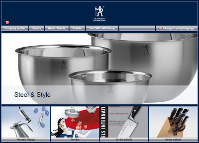
Henckels' website, October 20, 2012 (Source: http://www.j-a-henckels.com/en-CA)
Five days ago I looked at the Henckels website and noticed that two photographs on the website had as captions, (to be edited).
Henckels' website detail, October 20, 2012 (Source: http://www.j-a-henckels.com/en-CA)
And what do I see when I look today? No change at all. I'll keep checking back, but I'm not holding my breath. It looks as if firms are keeping their Facebook pages up to date, but letting their we website get old and stale.

Over a month after I notified a Montessori school in Kamloops they are still proudly proclaiming that, "We offer full or part time childcare services, as well as, a pre-school based on the infamous Montessori system."

Famous yes. Infamous, I hope not.

Labels: , , , ,

Friday, October 19, 2012

Buying reputation

iUniverse logo

iUniverse is a firm that offers self-publishing services for authors. The firm offers a wide range of packages with a somewhat bewildering list of features.


iUniverse publishing options (http://www.iuniverse.com/Packages/PackageCompare.aspx)
As the price goes up, the packages include more features. At the top end among the features included in the package are, "Book Buyer's Preview, Booksellers Return Program, Author Web Design Setup, Social Media Setup, Google/Amazon Book Search, Press Release-Web-Optimized Edition, Bookselling Promotional Materials (400), Book Signing Kit".


iUnivese publishing options (http://www.iuniverse.com/Packages/PackageCompare.aspx)

But the thing that I found to be quite remarkable was being to buy eligibility into the "Editor's Choice Recognition Program". This is available for buyers who purchase packages priced at $1299 or more.
iUniverse "Editor's Choice Recognition Program"
So, is this award worth anything? I'd put in the same category as a doctorate from a diploma mill. If you want to convince yourself that your book won a legitimate award, go for your life. I suspect you'll be fooling an audience of one.


Labels: ,

Thursday, October 18, 2012

Well, get on it!

Henckels Website
Henckels Website (Detail)
I have no idea how long the text below the knife and knifeblock on the home page of the Henckels website has said (to be edited). I'm guessing that it may have been a while. I saw this on October 15th, and I'll check back in a few days to see if they've fixed it.

This is a multi-million dollar, multi-national firm. There is no excuse to the this sloppy with your website. Unless of course the website has no affect on your marketing efforts, in which case, why have a site in the first place.

Labels: , ,

Wednesday, October 17, 2012

Clash of icons

The New Yorker, October 17, 2011 - Illustration by Barry Blitt
When Steve Jobs died in 2011 there was an outpouring of emotion and tributes.

I was going through some old magazines and found this issue of The New Yorker. Barry Blitt, the illustrator is one of my favourites. He shows a great, subtle sense of humour in all of his illustrations. He is originally from Montreal, and I first saw his work in magazines such as Toronto Life back in the 1980s.

I think the best part of this cover is the omnipresence of the iPad, including in the hands of Saint Peter at the Pearly Gates. Now that is market domination.

Labels: , , ,

Tuesday, October 16, 2012

I love it when they get the little things right

Knifewear Store in Kelowna
Showcase in Knifewear Store in Kelowna
It is not a big thing, but it is nevertheless important. Last week I came across a little shop in Kelowna. The shop, Knifewear, specializes in Japanese kitchen knives.

As you can see in the bottom photograph, the showcase is filled with something orange and yellow. (The same colours at the firm's trademark colours seen in the large piece of art behind the counter.)

The orange and yellow things are peas. A perfect thing for a knife store. Not so hard that they'll scratch the knives, and food which is a great fit with the merchandise.

Not to gush, but the knives are amazing. Japanese knives are remarkable and a HUGE step up over your old Henckel blades. The store offers mail order service and even free shipping to the US and Canada on overs over $200. Well worth checking out. (http://knifewear.com/)

Labels: , , , , , ,

Monday, October 15, 2012

But do you love New York?


culturedays.ca promotion postcard
Since its creation in 1977, Milton Glaser's "I Love New York" logo has been one of the most recognized and imitated pieces of graphic design.

And now I see it being adapted and used by culturedays. This was a weekend (September 28-30, 2012) to "create, participate & celebrate" culture.

I expect to continue seeing knockoffs of this iconic design for years to come. One of the more interesting re-imaginings of the design was a 2001 expansion on the original by Mr. Glaser himself.

In the wake of the September 11, 2001 attacks he expanded on the original idea with the addition of "More Than Ever" to the original design and added a black spot to the lower left of red heart, about the position of the World Trade Center on the island on Manhattan.

http://blogs.villagevoice.com/runninscared/ilovenewyorkmore.jpg
2001 Poster by Milton Glaser

Labels: , , , ,

Sunday, October 14, 2012

It helps to know your demographic

Brochure for Philips "Lifeline" medial alarm
For Thanksgiving we went for turkey dinner at The Royal Canadian Legion. Back in 1926, the Legion was "Founded for the cause of the veterans". These days all of the veterans of WWI are gone, there are an ever decreasing number of veterans from WWII, and those who served in Korea are getting up in years. (Many of the soldiers who have served in Afghanistan are shockingly young, but that is another story.)

So it should not be at all surprising that the Legion has partnered with Philips to promote the latter's "Lifeline" product. An "easy-to-use medical alarm service", Lifeline is a perfect fit with the Legion's aging demographic.

Is this entirely an opportunistic effort by Philips? I don't really think so. With the life expectancy going up all the time, there are more and more people in their 70s and 80s. And with the increased mobility of the population, the seniors can't always have a family member nearby, or even in the same area code. This sort of product fills an important niche.

Labels: , , ,

Friday, October 12, 2012

Red is forever and luxury

Bag stuffer from Bath&Body Works
Red has many meanings. Port. Right. Communist. Danger. Stop. And, of course, Love.

Bath&Body Works has released the firm's, "most luxurious fragrance ever". Is "Red" a good name? I'm not so sure. There are so many products and brands associated with the colour that I think that this is not a really sustainable position. (And that dress must be really awkward to walk in.)

Labels: , , ,

Wednesday, October 10, 2012

What if I don't drink Coca Cola?

Sign in a classroom at Okanagan College
Coca Cola glass
Source: http://www.flickr.com/photos/mtreinik/1434096809/sizes/o/in/photostream/
 
The curves of the Coca Cola bottle and glass are among the the most recognized commercial shapes in North America. And so what do I see on the poster in the classroom warning me that eating, drink and smoking are not permitted, but a glass that looks just like a Coca Cola glass. Does that mean that I can drink beverages that are not Coke?

Given that the poster is prohibiting smoking, I'd guess that it has been up on the wall for quite a while. And while I'm not keen to have a desk covered with sticky Coke, I also don't think that teaching in a smoky room would be much fun.

I do have another question. Is that cigarette a Marlboro?


Labels: , , , , ,

Tuesday, October 9, 2012

They're telling you where you can't buy the product

Source: http://en.stihl.ca/find-your-local-stihl-dealer.aspx
Not many manufacturers make a big deal out of where their products are not available. But Stihl uses its 1,000+ independent dealers as a key point of differentiation. The firm obviously feels that independent retailers give better service and provide better support for the Stihl brand. (And I'm sure that the current Stihl dealers would not be at all happy to see the brand at Canadian Tire or Home Depot.)

For Stihl, the distribution channel is a key point of differentiation. (Norco, the bicycle company also eschews big box retailers.) I own a Norco road bike, too bad I'm not in the market for a chainsaw.

Labels: , , , , , , , ,

Monday, October 8, 2012

You have to love typos

I was looking at a story from mediapost.com about the decline in business for greeting card firms. Hallmark is closing a plant in Kansas and will be laying off 300 people.

The Hallmark executive quoted in the story is identified as, "Pete Burney, Hallmark’s senior vice president who overseas production".

I'm sure the typo was inadvertant, but sending some of the production overseas is probably what has cost those 300 people their jobs.

So, perhaps Pete "oversees" production, or perhaps his goal is to "overseas" it. Either way, I would not count on those Hallmark jobs being in Kansas 5 years from now.

Source: http://www.mediapost.com/publications/article/184691/greeting-card-market-hurt-by-digital.html

Labels: , , , ,

Sunday, October 7, 2012

Everything, or perhaps only something, is on sale

Sale sign at Zellers
The Zellers stores are closing. Target has bought the chain and apparently the only thing interesting enough to keep was the real estate. (And they are not even keeping all of that.)

As a result all of the Zellers stores are selling off their remaining inventory at clearance sale prices.

Or are they?

Sale sign at Zellers
You see, I'm not very clear about the sale. Either the entire store is on sale or its not. This sign is just plain confusing. And confused consumer are never happy consumers.

Labels: , , , ,

Saturday, October 6, 2012

So good, yet not quite good enough

Rack card for Mt. Boucherie Winery
I'm a tedious, pedantic nit picker. (And there is no 12-step programme to help me.) I found this card for an Okanagan winery. What do I like about it?

It is really simple, the fonts match. Not that big a deal, but the font used for the words "Mt. Boucherie" is the same on the card and on the sign in the photograph on the card. As part of the winery's visual identity and branding, the font choice is one thing that some consumers recognize easily.

However, while the winery has the font right, somehow there is no certainty about the name. According to the text at the top of the rack card the firm is a "Family Estate Winery"
"Family Estate Winery"
 
 While the sign in front of the winery states that it is something else.
"Estate Winery"
So, is it a "Family Estate Winery" or is it an "Estate Winery"? The difference is slight, but if the "Family" designation is significant then why not change the sign in front of the winery, reshoot the photograph and reprint the rack card. Or perhaps it just doesn't matter, or just the winery thinks that no one will notice.

Labels: , , , ,

Okay, you're a winner. Why should I care?

"alive" magazine distributed by Nature's Fare Markets
I picked up this copy of "alive" magazine at a Nature's Fare Markets location. According to the cover this store is, "WINNER natural health retailer of the year"
WINNER natural health retailer of the year
While receiving this recognition is great, I want some context. When did Nature's Fare win? 2011, 2012, 1975? And who made the decision? Was it a local, regional, provincial, national, or international award? Did it come from one of the stores suppliers, or some industry association? Is it recognition from consumers or some local newspaper? How many other firms were in the running?

Unless you can provide some context, and convince me that this is somehow significant I'll just think it is another piece of marketing fluff. Even just adding the year would be a vast improvement in relevance.

Labels: , , ,

Thursday, October 4, 2012

I found the Ban (And we've got it on a deathwatch)

The deodorant aisle at The Real Canadian Superstore
Well, it took me a while, but I finally found the Ban deodorant. Searching the aisles at The Real Canadian Superstore I found the Ban on the bottom shelf in the middle of the aisle.

Ban on the bottom shelf in the middle of the aisle
The aisle as filled with Dove and Axe, but Ban, formerly a significant player in the deodorant business, was relegated to a space less that 20 cms wide. And with that amount of space, and that crappy location, I can't see sales rising any time soon.

I'd give the brand a year or so.

Labels: , , ,

What was this photo doing in East Side Mario's?

Henri Cartier-Bresson, 'Rue Mouffetard, Paris' (1954)
Source: http://www.nysun.com/pics/4425.jpg
According to the firm's website, "East Side Mario's is a chain of authentic Italian restaurants that offers great value, even better food, and a fun, lively atmosphere for the whole family." Source: http://www.eastsidemarios.com/

So what is a copy of this iconic photograph of a young boy in Paris doing in a restaurant that purports to be "authentic Italian"? Are there no photographs of young boys in Rome? Does the management think that no one will know that the boy is French and not Italian? Is the use of this photograph in the restaurant the result of ignorance or an attempt at deception. (Making people think it was shot in Italy.)

Just another detail in retail that someone got wrong.

Perhaps the restaurant should have this photograph up on the wall instead?
Ruth Orkin, "American Girl in Italy" (1951)
Source: http://www.orkinphoto.com/photographs/american-girl/

Labels: , , , , ,

Wednesday, October 3, 2012

No really, we're not trying to evoke anyone's name

"Pier Cardian" backpack
I saw a fellow with this backpack at the bus stop this morning.
"Pier Cardian" label
I saw it an immediately thought of Pierre Cardin. In fact when you put "Pier Cardian" into Google the first results are for Pierre Cardin.

So, can the makers of this backpack really make any defensible claim about trying to confuse the general public? I think not.

PS And yes, again another crappy photograph from me. A new phone is in the works.

Labels: , , , ,

Tuesday, October 2, 2012

Red is Hot and Blue is Cold


Taps in Okanagan College washroom
It is standards like this, red for hot and blue for cold, that stops people from getting scalded in the bathroom. (Don't get me started on the whole washroom, bathroom, toilet discussion.)

Of course the other part of the standardization, or lack thereof, is the positioning. Is hot on the left or right? In the audio and video worlds red is used to indicate the cables for the right channel, while for sailors red indicates the port (left) side of the ship.

But regardless of whether red is left or right, it seems to be a fairly standard designation for hot. And that should help my young daughter to avoid scalding herself in unfamiliar bathrooms.

Labels: , , , ,

Monday, October 1, 2012

Women are round and Men are pointy

Sign on the Women's washroom at Okanagan College
Sign on the Men's washroom at Okanagan College
I don't how it happened, but evidently it has been decreed that Women are circles and Men are triangles. Do washroom users make the association between shape and gender? I guess they will with enough repetition.

And the irony is that the woman in the skirt, on the top sign, looks quite triangular.

Labels: , , , ,