Saturday, October 31, 2015

Making an effort

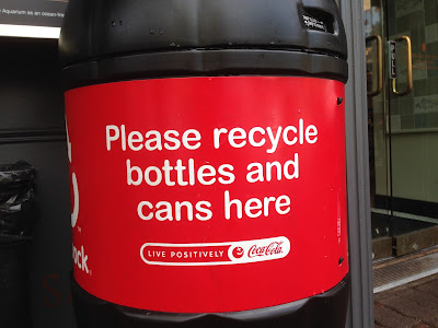
Coca-Cola recycling container, Horseshoe Bay, BC

Coca-Cola recycling container, Horseshoe Bay, BC (Detail)

Coca-Cola sells almost 2 billion servings a day. That is a lot of bottle and cans. In its earlier history Coke was sold in refillable glass bottles. Today, in most countries, Coke is sold in single-use aluminum cans and PET (polyethylene terephthalate) bottles. 

The huge volume of empty Coke containers represents a consistent potential PR problem for the Coca-Cola company. 

Recycling containers, such as this one, serve two purposes. They position Coca-Cola as an environmentally responsible company, and they also serve to at least partially eliminate empty containers from the waste stream. 

So, regardless of whether you like Coke, providing recycling bins is a good things to do. (And the fact that the bins are in the iconic Coke bottle shape is just an added bonus for Coca-Cola.)


Labels: , , , , ,

Thursday, October 29, 2015

Does that look "On Time" to you?

Bowen Island Ferry schedule, October 27, 2015
BC Ferries has very strict rules about punctuality. Passenger must buy their tickets 10 minutes before the scheduled sailing time. If you miss that time by a minute, then you just wait for the next boat.

So why does BC Ferries call leaving 8 minutes late "On Time". This sort of inconsistency drives customers crazy. One standard for the company, and a different one for the customers. And BC Ferries has the gall to boast about its service and "On Time" performance.

Labels: , ,

Wednesday, October 28, 2015

They know who is doing the spending

Kiehl's window, The Hudson's Bay Company, West Georgia Street, Vancouver, BC

Kiehl's window, The Hudson's Bay Company, West Georgia Street, Vancouver, BC (Detail)
I'm seeing more of this in the cosmetic departments on the ground floor of The Hudson's Bay store in Vancouver, bilingual signs in English and Chinese.

Given the demographics of Vancouver, 50% of residents were born outside Canada, I suspect that we will see more of this in shops downtown. I wonder if other languages are on the way?

Labels: , , ,

Tuesday, October 27, 2015

So much clutter, so little effect

Signs at the bus loop in New Westminster, BC

Clutter is the enemy of effective communications. And what could you call these 18 signs but clutter? The one for CIBC stands out because it is at the end and uses some white space, but most of the others are crammed with too much information.

And it I took away or changed half of them would anyone notice? The problem is that the businesses fall into lockstep and have a sign because everyone else does, and the more signs there are the less effective each one is.

Labels: , ,

Monday, October 26, 2015

Who'd have thought that these firms would have competition?

Fireworks store, West Broadway, Vancouver, BC

Halloween fireworks is a tradition in British Columbia. Pop-up stores open for a few weeks and then disappear until next October. But in 2015, these pop-up stores are having problems finding space.

And the culprit? Marijuana dispensaries. Over the past year or so dozens of new dispensaries have opened up in Vancouver, gobbling up the already scarce retail space.

And the future of the dispensaries? Who knows? The new Liberal government has promised to legalize marijuana, but the final distribution structure is yet to be determined. Pharmacies and liquor stores are two options I've heard.

Labels: ,

Sunday, October 25, 2015

Combating the scourge of the private label product


Polysporin KIDS! packaging

I have a young child. Like most kids, she has her share of cuts and scrapes. (She has broken her arm twice and almost sliced the top off her thumb with a broken Mason jar.)

It is not surprising that we go through a few tubes of Polysporin a year. The last time I bought some Polysporin I saw this notice in tiny type on the side of the box.

Notice on the side of the Polysporin KIDS! box

Given the rising standards of "store brand products", in some cases surpassing the quality of the national brands, this is an interesting claim to make. For "wound care" as the firm refers to the category, Polysporin pretty much has a lock on brand recognition. So, it is not surprising that the firm would assert its authenticity. 

The LIFE brand product at Shoppers Drug Mart is not Polysporin in a different box. If you want the performance that you've come to expect with Polysporin then you have to buy authentic Polysporin. 

Polysporin KIDS! box

Labels: ,

Saturday, October 24, 2015

Sharpie, Glam, and Limited Edition (Three things I don't normally put together)


Limited Edition Sharpie "80's Glam" (Photo taken at London Drugs)
Some of these colours I associate with the 1980s. (Not sure about that yellow.) But limited edition? Really? These are non-refillable pens. When the ink runs out the pens are going in the bin. (And the date should be '80s, not 80's.)

Those complaints aside, I do like the illustration in the background. It looks like it is supposed to be reminiscent of  Patrick Nagel's work. In the late '70s and early '80s he did lots of work for Playboy, but his best known illustration was the cover of the 1982 Duran Duran album "Rio".

"Rio" by Duran Duran
(Source: https://upload.wikimedia.org/wikipedia/en/a/ac/DuranRio.jpg)

Labels: , , , ,

Friday, October 23, 2015

I'm not 100% sure this was authorized

Chanel iPhone case

One of my students has this case on their iPhone. Quite striking looking. I wondered where such cases might be obtainable and discovered pages of them on the AliExpress.com website.

AliExpress is part of Alibaba, so it is not completely surprising that these cases, available for under $5.00, are perhaps not authorized by Chanel.

Brands spend enormous  amount of money policing unauthorized uses of their trademarks and designs, but these days it seems to be an uphill battle. But unless brands enforce and protect their trademarks the value of those brands will inexorably decline. And if consumer are not willing to pay the premium for "real" branded goods, then the future of brands looks a bit dire.

Labels: , ,

Wednesday, October 21, 2015

If you want to be taken seriously you need to set a good example

VoteBC.ca flier

On Monday October 19, 2015 there was a federal election in Canada. Interest was very high and the turnout at the advance polls was record breaking.

Canada's "first-past-the-post" system means that the winning candidate can be the first choice of a minority of the electorate. (The case in the previous election.)

VoteBC.ca is an ettempt to change this. But I'd take the group more seriously if the members took a bit more time proof reading the fliers. It should be "Let's make sure you can at the election after Monday's".

Just being annoying and pedantic.

Labels: ,

Tuesday, October 20, 2015

This promotion must have been a big bust

Quaker Chocolate Chip Granola Bars, Real Canadian Superstore, October 6, 2015

Quaker Chocolate Chip Granola Bars, Real Canadian Superstore, October 6, 2015 (Detail)

Great, I can "get 1 free"! Oh, wait a minute, this offer expired over 6 weeks ago.

Well, that is a bit annoying. I'm glad that I didn't buy one of these boxes of bars thinking that the offer was still valid.

The retailer should ensure that these boxes are either sold before the offer expires, or sent back to the supplier. Someone goofed.

Labels: , , , ,

Monday, October 19, 2015

When does everything not mean everything?

Sign outside Eddie Bauer, Oakridge Centre, Vancouver, BC

Last week I saw this sign outside the Eddie Bauer store at Oakridge Centre in Vancouver.

Either everything is on sale, or everything isn't on sale. Everything includes "every single thing". So how can "everything" not mean "everything"?

I wonder if I can play the "Full Price"*

*Exclusions apply

Labels: , ,

Saturday, October 17, 2015

It's that time of year again

Nestle's Halloween-themed chocolate bar packages
Many firms release limited edition products. This time of year Starbucks offer pumpkinspice lattes. (Which after relying on chemistry for many years, now finally contain actual pumpkin.)

But these chocolate bars are exactly the same as the bars that Nestle sells the rest of the year. The only that changes is the packaging.

Nestle can't really be faulted for the effort. The names are somewhat clever. (Coffin Crisp is probably the best of the four.) It just goes to show how big Halloween has become as a focus of consumer spending.

Labels: , , , , , ,

Friday, October 16, 2015

A rather poor design

Compliments Macadamia Madness cookies from Sobey's

Good packaging is essential in the CPG (consumer packaged goods) business. Loblaw upended the grocery business in the 1980s and 1990s with its President's Choice products. (Evidently President's Choice Decadent Chocolate Chip Cookies are the top selling cookie in Canada.)

So, why can't Sobey's do better than this uninspiring mishmash? The cookies are okay, but not amazing, and there is just too much unconnected imagery fighting for attention on the package.

I expect better, and if Sobey's want to seriously compete with Loblaws then better packaging is in order.

Labels: , , , ,

Thursday, October 15, 2015

I see red

Liberal Party of Canada logo
(Source: https://www.liberal.ca/official-graphics/)

"When my baby's walking down the street I see red.". (I See Red, music and lyrics by Neil Finn)

In Canadian politics the Liberal party has a lock on the colour red. Interestingly, in the United States red belongs to the Republicans, a party that seems to share very few of the same values as the Liberals.

But red also belongs to Air Canada, Canadian Tire, Rogers, Target, Virgin, and many others. I guess that is one of the perils of a popular colour; it is popular with so many organizations.

And there are all of the less savoury connections with red. It is the colour of danger and warning. But is is also the colour of love.

Love them or hate them, these five colours will decide the future of Canada for the next five years.

So get out and vote, or don't dare have the temerity to complain about what happens in Ottawa.


Labels: , , , , ,

Wednesday, October 14, 2015

Hey, we're blue too!

Bloc Quebecois logo
(Source: http://www.blocquebecois.org/wp-content/themes/bloc/images/og-logo.jpg)

The Bloc has no choice. If the goal of the party is to forge an independent nation from the province of Quebec, the blue of the Quebec flag is the logical starting point.

And the stylized B made from the fleur de lis is a nice touch. Of course, outside the province of Quebec the party runs no candidates. The interesting thing is that many voters in the rest of Canada would support the Bloc's position on lots of issues, if only it was not so adamant about seeking independence.

Ah politics, the art of not getting what you want, but settling for what you need.


Labels: , , , , , ,

Tuesday, October 13, 2015

Green with envy

Green Party of Canada logo
(Source: http://www.greenparty.ca/sites/default/files/logo_green_160_en_0.png)

Is there any other colour that this party could use? It absolutely has to be green.

And green has all sorts of other associations that are both positive and also fit with the goals of the party; fresh, growing, environmental, trees, plants, etc.

While not as popular as some colours used by brands, green is popular with brands that have an environmental slant, or want to be perceived that way.

But it is also the colour associated with one of the seven deadly sins, envy. But I think that the Green Party would like Canada's environmental record to be the envy of the world. Perhaps not a bad position to aim for.

Labels: , , , , , , ,

Monday, October 12, 2015

Orange you glad I didn't say banana

New Democratic Party logo
(Source: https://upload.wikimedia.org/wikipedia/commons/thumb/4/43/Orange_NDP_logo_English.svg/2000px-Orange_NDP_logo_English.svg.png)
Orange is an odd colour for a brand. But then some might say that the New Democratic Party (NDP) is an odd political party.

An unusual combination of unionists, environmentalists, and pacifics (among other groups), the NDP has staked out a position on the left side of Canada's political spectrum.

In England and Australia this position is the domain of the Labour Party (UK) or Labor Party (Australia). Both of the labour/labor parties use red as their colour, but in Canada that colour belongs to the Liberals.

So the NDP is stuck with this hideous orange, a colour that almost no other brand uses. Who can you think who uses orange as part of their branding? Home Depot?

The Home Depot logo
(Source: https://upload.wikimedia.org/wikipedia/commons/thumb/5/5f/TheHomeDepot.svg/2000px-TheHomeDepot.svg.png)

The "Ex" in the FedEx logo?

FedEx logo
(Source: http://xk9.com/wp-content/uploads/2014/06/FedEx-logo-big.jpg)
And the origin of the title of this post? A horribly bad knock knock joke.

"Knock, knock.
Who's there?
Banana.
Banana who?
Knock, knock.
Who's there?
Banana.
Banana who?
Knock, knock.
Who's there?
Banana.
Banana who?
Knock, knock.
Who's there?
Orange.
Orange who?
Orange you glad I didn't say banana?"

Source: http://jokes.cc.com/funny-food/panmgr/knock--knock----banana


Labels: , , , , , ,

Sunday, October 11, 2015

What does blue mean to you?

Conservative Party of Canada logo
(Source: https://upload.wikimedia.org/wikipedia/en/thumb/3/3b/Conservative_Party_of_Canada.svg/1107px-Conservative_Party_of_Canada.svg.png)

All of the major political parties in Canada use a signature colour as part of their branding. For the Conservative it is this shade of blue.

Blue is a colour associated with stability. It is reliable and dependable. And not surprisingly it is the colour used by IBM and Bell Telephone, two large companies that pride themselves on their image of reliability.

But blue is also the colour associated with depression, "I'm feeling blue", and the Democratic party in the United States.

The contrast of the blue "C" with the red maple leaf is quite effective.

I read one commentator who observed that as the Conservative Party logo was red, white, and blue, the obvious message to him was that the party wanted much closer relations with the United States. Interesting observation, but a bit of a stretch.

Given the colours of their national flags, you could make the same observation about closer relations with France and/or Russia.

Note: I'll be covering all five of the major parties and picked the order at random. It will be blue, orange, green, blue, and red.

Labels: , , , , ,

Saturday, October 10, 2015

It's all about colour

Elections Canada Promotion
(Source: http://ckpmfm.com/wp-content/uploads/2015/10/elections-canada-ready-to-vote.png)
Elections Canada signage at Poling station
(Source: http://wpmedia.montrealgazette.com/2015/09/elections-canada-opened-their-offices-in-the-nav-centre-on-t.jpeg?quality=55&strip=all&w=840&h=630&crop=1)

Canada is getting towards the end of the federal election campaign. According to its website, "Elections Canada is the independent, non-partisan agency responsible for conducting federal elections and referendums." (Source: http://www.elections.ca/home.aspx)

Part of the agency's mandate is to ensure that the process is not only free and fair, but also maintains the appearance of being free and fair.

Therefore one of the things that Elections Canada monitors is the presence of election material; signs, posters etc., within a certain distance of the polling stations. No one; staff, scrutineers, or voters, is permitted to wear any partisan pin, badge, tee-shirts etc. inside the polling station.

This prohibition on perceived partisanship also extends to the clothing worn by the staff and scrutineers in the polling stations. Each of the five major political parties in Canada has its own colour. Two shades of blue, green, orange, and red.

And that is why I saw lots of black, white, and grey clothes.

It is interesting that Elections Canada also uses colour as part of its branding. Burgundy for its web site and more "official"  communications, but yellow when it comes time to get out the vote and tell people where to cast their ballot.

I voted at an advance poll yesterday, and was a bit surprised at how busy it was. I heard that at some polling stations the wait was over an hour. It just shows that, despite the mind-numbing length of this campaign, people are still interested in participating.

Labels: , , , , ,

Wednesday, October 7, 2015

The ad may be gender neutral, but the not the merchandise

Diesel advertisement 

Diesel website (October 6, 2015)

Despite the fact that Diesel proclaimed gender neutrality in its advertising, the clothing is still relentlessly divided by gender.

Why do brands do stuff like this? Do the various areas of marketing not talk to one another? If the message in not consistent from channel to channel then there really isn't any message worth telling at all.


Labels: , , , ,

Tuesday, October 6, 2015

Thousands of copies, but has anyone read this book?

Handing out free copies of "The Hope We Seek", Granville Street and West Georgia Street, Vancouver, BC
Book cover, "The Hope We Seek"

The people distributing these books are expected to hand out 1,000 copies per day. And they are giving the books away for free.

And even at that price the employees are having a hard time meeting their quota.

The first review on Amazon give you a bit of hint about the quality.

"This is the largest compilation of written nonsense ever written. Rich Shapero must have just discovered a thesaurus. I feel sorry that trees were wasted on the printing of these books." (Source: http://www.amazon.com/SHAPERO-SONGS-WHEEL-HARDCOVER-BOOKS/dp/B00I48907E)

Sometimes free isn't even cheap enough to make the sale with some people. I picked up the book, I doubt I'll ever read it, but will talk about it in class.

Labels: ,

Monday, October 5, 2015

Consistently great display windows

Display window for The Room, The Hudson's Bay Company, Seymour Street, Vancouver, BC

Display window for The Room, The Hudson's Bay Company, Seymour Street, Vancouver, BC (Detail)

Display window for The Room, The Hudson's Bay Company, Seymour Street, Vancouver, BC (Detail)

Every few weeks The Room has a new display window at the Seymour Street entrance to The Hudson's Bay Company store in Vancouver.

The windows are eye catching and always clever.

I won't ever be a customer, The Room only sells women's wear, but I do admire the great displays.

Labels: , , ,

Sunday, October 4, 2015

Advertising decay

Advertisement for Central City Shopping Centre, Broadway & Commercial SkyTrain station, Vancouver, BC
(Photograph taken September 24, 2015)

Advertisement for Central City Shopping Centre, Broadway & Commercial SkyTrain station, Vancouver, BC (Detail)(Photograph taken September 24, 2015)
I wrote about this advertisement before. (http://mba4rent.blogspot.ca/2015/09/a-great-big-mess-of-logos.html)

The contest that the advertisement promotes finished four days before I took this photo. And not only is the contest over, but the advertisement fell prey to petty vandalism.

This is a common fate for advertisements that the public can touch. They often peel the vinyl off leaving this sort of mess.

There is no solution, the best way of dealing with it is vigilance and maintenance, both of which seem to be in short supply.

Labels: , , , ,

Saturday, October 3, 2015

What will get their attention?


Advertisement for Lougheed Town Centre, Broadway Commercial SkyTrain station, Vancouver, BC

Advertisement for Lougheed Town Centre, Broadway Commercial SkyTrain station, Vancouver, BC
These two advertisements work quite well together. The messages are different, but complementary. For some shoppers ease of access and parking is a key factor, for other the mall's anchor tenants are the big draw.

I do find it interesting that the top advertisement lists the retailers alphabetically by name, while in the bottom advertisement the order is different with Hudson's Bay and Walmart Supercentre getting top billing.

But of course the real point is will this campaign get shoppers to get off the SkyTrain and do their shopping at Lougheed Town Centre, or will the weary commuters just continue on to shopping centres closer to their final destination?

Labels: , , , ,

Friday, October 2, 2015

Why is this only for boys?

DIY for BOYS-Speed Machines
(Source: http://www.amazon.com/Speed-Machines-Boys-Ruth-Owen/dp/1477762744/ref=sr_1_5?s=books&ie=UTF8&qid=1443704349&sr=1-5&keywords=diy+for+boys)
I saw this book on the shelf at my local library and the questions started.

Why is this DIY book only for boys? My daughter has a skateboard, she love one of those carts, and we make paper airplanes all the time.

This book was published in 2014. Have we not moved a bit beyond this sort of gender stereotyping? The publisher, Rosen Publishing, does not publish a corresponding "DIY for GIRLS" series, but does offer a bunch of "MAKER KIDS" books, many of which feature girls on the covers.

High-Tech DIY Projects with Musical Instruments
(Source: http://www.rosenpublishing.com/index.php?page=shop.product_details&flypage=flypage.tpl&product_id=156693&category_id=768&option=com_virtuemart&Itemid=1)

I'm not complaining about the content of the DIY for BOYS series. Books on going fast (Speed Machines), camping out (Roughing It), and generally goofing around (Practical Jokes) are great, but they are great for boys AND girls. Why not just call it DIY for KIDS?

Labels: , , , , , ,

Thursday, October 1, 2015

So, how much is it?


Globe2Go
(Source: http://globe2go.newspaperdirect.com/epaper/viewer.aspx)
Globe2Go pricing details
(Source: http://globe2go.newspaperdirect.com/epaper/viewer.aspx)

Depending which numbers I trust, "Pay As You Go" access to a single day's issue is either 1.99₵, 99₵, or $1.99.

So, an issue will cost me under 2 cents, just under a dollar, or just under two dollars.

Is this any way to run an on-line business?

Labels: ,