Monday, June 27, 2016

No one should really be surprised

Shoes.com store, 356 Queen Street West, Toronto
(Source: http://www.shoeme.ca/blogs/live/80095812-hey-toronto-the-first-shoes-com-storefront-is-open)

In December of 2015, ShoeMe.ca, also known as Shoes.com,  opened its first bricks and mortar retail store in Canada. This move from "clicks" to "bricks" is one that a number of eCommerce firms have made. Whether it is as a short-term popup location, or as part of a multi-channel strategy it seems to be growing in popularity.

There are many advantages in having a physical store, especially if the retailer is unsure about consumer reactions to new product lines or product mixes. Much easier to test a small quantity in a single store than commit to a container load only to have the merchandise flop.

But the key question is how does a firm like ShoeMe/Shoes get a prime spot on a hot retail location such as Queen Street west? Easy, you go into a spot that used to a crocs store.

Former crocs store, 356 Queen Street West, Toronto 
(Source: http://torontoist.com/attachments/Sarah%20Prickett/2008_08_27crocpot_1.jpg)

It is intersting that in the background you can see another two firms that have either scaled back or completely abandoned the Canadian retail market. FCUK and MEXX.


Labels: , , , , , ,

Saturday, June 25, 2016

Tell them everything they need to know (Or why content is king)

2016 National Blood Donor Week flier from Canadian Blood Services

2016 National Blood Donor Week flyer from Canadian Blood Services (Reverse)

I donate blood, 323 times at last count. Half of the Canadian population is eligible to donate, but only 1 in 60 actually does.

So an event like National Blood Donor Week should be an occasion to raise awareness, rally the population, and find those 714 donors that are needed every week.

People were handing out this flyer at the Granville Skytrain station. Great. Raise awareness and fill all of the available appointments.

Great, except that the flyer does not indicate what the dates of National Blood Donor Week. (It was June 13 to 18, 2016.)

What a missed opportunity. What conceivable reason could there be not to include the dates on the flyer? It can't be that Canadian Blood Services (CBS) was hoping to reuse the same flyers next year. What if the clinic hours change?

And the final irony is that these flyers were being handed out only blocks from a permanent blood donor clinic, the address of which is not even listed on the flyer.

Permanenent blood donor clinics in Vancouver, BC
(Source: https://www.google.ca/webhp?sourceid=chrome-instant&ion=1&espv=2&ie=UTF-8#q=blood%20donor%20clinic%20vanocuver)


Yes CBS you do good works, you just need to promote them better. Better content equals better communications and hopefully more donations.

Labels: , ,

Friday, June 24, 2016

Oh so close (Or how paying attention to all of those little things can make the good even better)

Yesterday I wrote about Thinkific and the firm's platform for delivering online courses. I signed up and then went online to have more of a look around the site. I saw a link for a case study on building sales and signed up. This is part of the reply that I received.

eMail from thinkific.com with link to case study.

The response was quick and I downloaded the case study. But in reading over the eMail I noticed the line, "The next step if you haven't already done so is to create your own Thinkific account". This surprised me as I had already created my own Thinkific account. How hard would it be to link the two databases, accounts and prospects, to customize this email?

I looked over the case study. It is filled with useful and practical tips and a step-by-step guide taking you through how John Michaloudis of myexcelonline built a successful online business using Thinkific. All well and good, until I get to the last page. This lists the Thinkific's street address as #604-55 East Cordova Street.

Company address on "0 to 20,000/month with Webinars & Thinkific Case Study"
(Source: https://www.dropbox.com/s/ebr00n6aup37e6c/Thinkific-Webinars_CaseStudy.pdf?dl=0) 

However, when I go to the Thinkific website I see that the firm is currently located on Alexander Street.

"Contact Us" page on Thinkific website
(Source: https://www.thinkific.com/contact/)

Yes, I know that I'm being petty and that most people would never notice stuff like this. For a business that does all of its business online is the street address really important?

Well yes and no. Having the current address on the PDF will probably not lead to a big increase in business, but it does speak to a thoroughness that I'd like to see in any firm I do business with.

Labels: , ,

Thursday, June 23, 2016

Looks great, could be even better


Screen capture from Thinkific website
(Source: https://www.thinkific.com/)
Ever since the early 1990s, when Tim Berners-Lee unveiled the World Wide Web, education has been moving online. The location of the student, the instructor, and even the institution offering the courses is no longer relevant.

Thinkific is a Vancouver-based firm that helps educators build their online courses. I use the term educators is in broadest sense, and so does Thinkific. No longer is the provision of education restricted to accredited and ivy-covered institution staffed by PhDs. Education is increasingly about taking your expertise and finding a way to share it with willing students all over the world. Great courses can be delivered by people who have built up valuable experience in a field that may not have even existed a few years ago.

Among the courses that are featured on the firm's site is one from a guy (Chris Newman of CineChopper University) who teaches people how to fly their drones. Who knew that this was an area where there was a need for education, and even more importantly, qualified people to ready, willing, and able to deliver the course? (And before you ask, yes there is a need for education as abiding by the rules and regulations from aviation authorities such as the FAA is critically important if you want to avoid big fines and possible jail time.)

Thinkific blog post about Chris Newman's CineChopper University
(Source: http://blog.thinkific.com/success-story-chris-newman-built-business-teaching-others-fly-drones/) 

But is this site perfect? Well, what site is? As I scrolled down the webpage I saw this graphic listing six benefits of the Thinkific platform. Cool! I was intrigued. I moved my mouse to one of the circles and clicked and was a bit surprised that I was not taken to a page that provided more information about that particular benefit.

Screen capture from Thinkific website
(Source: https://www.thinkific.com/)
In the meanwhile I'm intrigued by this firm and its services. (Did I mention that Thinkific offers a free version to get you started?) I know of a few people who could take their existing classroom-based education model and move it online. Thinkific looks like a quick and easy way to make the transition.

I'll let the firm know about my observations and see what happens.

Labels: , ,

Tuesday, June 21, 2016

Does TD Bank own "Green"? Evidently not anymore

Signs in Easy Financial office, King George Highway, Surrey, BC

Sign in Easy Financial office, King George Highway, Surrey, BC

I've always associated the green colour with TD bank. The bank's ATM machines are referred to as "Green Machines".

Will the green colour on these signs lead consumers to think that easy financial is associated with TD Bank? I hope not. The interest rates at easy financial are about 10 times  more than TD Bank charges.

Oh well. Let the buyer beware.

Labels: , , , , ,

Monday, June 20, 2016

Everything's right, except the product

Advertisement for Grower's Cider, Granville SkyTrain Station, Vancouver, BC 

Advertisement for Grower's Cider, Granville SkyTrain Station, Vancouver, BC (Detail)

This is the sort of detail that should have been caught by someone. The position of can on the knee is so contrived and obvious, and the positioning of the hand on the can ensures that the logo is visible. So how could the language on the front of the can not be obvious to the stylist or photographer?

Is there an English-language can being used in a French-language advertisement in Quebec?

Labels: , , , ,

Saturday, June 18, 2016

Shot in BC, but promoting California?

Advertisement for Growers Cider, Granville SkyTrain station, Vancouver, BC

Advertisement for Growers Cider, Granville SkyTrain station, Vancouver, BC (Detail)

Advertisement for Growers Cider, Granville SkyTrain station, Vancouver, BC (Detail)

One of the walls at the Granville Skytrain station is now covered with a series of posters promoting Growers Cider. The strap line is "Grow Your Summer".

In some of the posters is it obvious that the photographs were taken around Vancouver.

So, my question is, why is this model wearing a tee-shirt emblazoned with "Los Angeles California".

Labels: , , , ,

Friday, June 17, 2016

As if it wasn't bad enough already

Advertisement for Budweiser"Prohibition Brew", Granville SkyTrain station, Vancouver, BC

Advertisement for Budweiser"Prohibition Brew", Granville SkyTrain station, Vancouver, BC (Detail)

Advertisement for Budweiser"Prohibition Brew", Granville SkyTrain station, Vancouver, BC (Detail)

Budweiser commands a share of the market out of all proportion with the quality of the beer. Common complaints are that it is weak, tasteless, and watery.

And now Budweiser has come out with a non-alcoholic beer. Why even bother?

Labels: , , , ,

Thursday, June 16, 2016

It is an Adidas shoe?

Shoe for Bratz doll

Bratz dolls are a more fashionable alternative to the traditional Barbie. One of the distinctive features of the dolls is that they have no feet. Unlike Barbie, whose feet are moulded to fit a stiletto heel shoe, the bottom of the Bratz legs have a small plastic plug that fits into any shoe.

This particular shoe caught my eye as it looks like an Adidas football/soccer shoe, but with only two of the three stripes coloured in orange.

Does this breach the Adidas trademark three stripes? I think that is clearly the intention. Whether a judge would agree is a different matter.

Labels: , , , ,

Wednesday, June 15, 2016

Another year of great ads

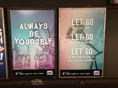
Advertisements for Playland, Granville SkyTrain station, Vancouver, BC

Every year I look forward to the new campaign for Playland. Rethink, Playland's agency for over 10 years, consistently comes up with creative, award-winning campaigns.

This year's ads are no exception. They look great and capture the feeling of stomach-churning rides. (When I saw the "Let Go" one I presumed that that someone had been listening to a little bit too much Frozen.)

I'm keen to see the rest of the campaign. I have high hopes.

Labels: , , , ,

Monday, June 13, 2016

How did this happen?

Advertisements for TD Bank and Tangerine, SkyTrain station, Vancouver, BC

I saw this last week. Any media buyer worth their title should have rigid clauses in their contracts to prevent things like this from happening. Having your advertisement between two ads for one of your competitors sends a very confused message to consumers.

I'm not really sure who this harms the most, but both TD Bank and Tangerine (owned by the Bank of Nova Scotia) should complain.

Labels: , , , , , , ,

Sunday, June 12, 2016

Not the worst advertisement to keep up after the event

Sport Chek advertisement, Vancouver City Centre SkyTrain station, Vancouver, BC

Sport Chek advertisement, Vancouver City Centre SkyTrain station, Vancouver, BC (Detail)

Ads that are still on display long after the event bug me. But in this case the advertisement is worth keeping up. The new Sport Chek store in downtown Vancouver is located in the former Indigo books location at Robson and Howe.

The space had been empty for months and after renovation opened with a flourish. Even though the Grand Opening was a month ago, keeping these advertisements up does serve a useful purpose, letting consumers know that the store is finally open.

Although I do wonder how much longer the ads will remain up. Hopefully not almost three months after the opening like this one for the Vancouver Film School's open house.

Vancouver Film School advertisement, Granville SkyTrain station, Vancouver, BC (Photograph taken June 3, 2016)

Labels: , , , , ,

Saturday, June 11, 2016

Doesn't anyone want to talk about bus fares?

Advertisement for Trans Link Fare Review, SkyTrain car, Vancouver, BC

Trans Link, the central transit authority in the Vancouver area, is conducting a review of fares. But it looks as if not everyone's voice is welcome.

According to the images on the poster there are only four things worth talking about.
SkyTrain, the Compass card, fare zones, and the Seabus. Evidently no discussion of buses is to be entertained.

A bit odd given how central buses are to the system. But with the introduction of the Compass card all of the buses are now a single zone with a single fare. So I guess there is nothing to talk about.

Nothing like cutting off discussion before it has even started.

Labels: , , , ,

Friday, June 10, 2016

Changing the pricing, but not changing the sign

Sign outside Freshslice Pizza location, UBC, Vancouver, BC

Sign outside Freshslice Pizza location, UBC, Vancouver, BC (Detail)
The price of a slice of pizza at Freshslice was $1.29 and then rose to $1.43. ($1.50 with tax.)

But due to increasing costs Freshslice split its menu in half and now charges an extra 50 cents for "Feast" slices. This change came into effect months ago.

But some locations are either unwilling to update their signs, or are using the sign with the now abandoned "Any slice" policy as a "bait and switch" tactic.

Either way is is not the sort of behaviour that I will reward with my business.

Labels: , , ,

Thursday, June 9, 2016

Making good use of a disaster

Canadian Red Cross advertisement, Granville SkyTrain station, Vancouver, BC

Canadian Red Cross advertisement, Granville SkyTrain station, Vancouver, BC

The fires in Fort McMurray are turning out to be an even bigger disaster than anyone anticipated. And it is not the fire that is causing the biggest problems, but the toxic ash that the fires left behind.

According to a story on the CBC website ;
"The ash has a very high pH which makes it caustic and may cause both skin and respiratory irritation and burns," said Dr. Karen Grimsrud, Alberta's chief medical officer of health.
"There's also heavy metals like arsenic in these samples. As well, polyaromatic hydrocarbons, dioxins and furans have been detected at concentrations above what has been recommended for public health."
And it is into this environment that the Canadian Red Cross has launched a campaign to raise awareness about disaster preparedness. 
Given that the coastal areas of British Columbia is overdue for a big earthquake I'd have to say that the timing is pretty much perfect.

Labels: , , ,

Ends Soon! But when?

Advertisement for Toyota "Red Tag Days", Vancouver City Centre SkyTrain station, Vancouver, BC

This advertisement provides almost none of the essential information that the modern consumer might expect.
  • When did the sale start?
  • When does it end? ("Soon" is not really enough information.)
  • Where are the dealerships? (Or if you don't include the names of the dealerships, how about a URL for the listing of the local dealers?)
And to make it worse, I contacted three dealerships and no one knew off hand when the "Red Tag Days" ended. Two dealerships passed me over to sales people who didn't know, while at the third dealership the receptionist managed to get the information for me. (The promotion runs until the end of June.)

And to make it worse, this is not the first time that Toyota has run this promotion. Overall a rather poor execution.

Labels: , , ,

Tuesday, June 7, 2016

Is sugar really all that bad?

Sugar container, Bowen Island Coffee Roasting Company, Bowen Island, BC

Sugar, like most other foods, is fine in moderation. It is the 250 grams of the stuff in a 2 litre bottle of soft drink that causes the problem.

30 or 40 years ago the average portion size for soft drinks was a fraction of the enormous "Big Gulp" and "Super Big Gulp" that some people seem to require today.

Is using sugar irresponsible? Probably not, and anyway I prefer to have my coffee with sugar than aspartame.


Labels: , , , , ,

Monday, June 6, 2016

Does anyone really know what day it is?

Grates on an unpaved road, Metro Vancouver, BC

These metal grates are on a steep, unpaved road near where I live. The grates are over a concrete channel that acts as a conduit for water, preventing the sometimes torrential rainfall from washing out the road.

I presume that the numbers are a production date. But what is the date?

  • December 6, 2003?
  • March 12, 2006?
  • December 3, 2006?

Based on the numbers on the grate at the bottom of the photo I presume that the format is Month Day Year, so March 12, 2006. But given that all of the numbers on these two grates are 12 or under, there is no sure way of telling.

If this date is intended to be some form of production tracking or quality control system, it is a bit confusing and does not seem to really do the job. At least to my untrained eyes..

Labels: , ,

Sunday, June 5, 2016

Two worlds that you don't expect to colide

Hello Kitty Scooter at Superstore, Vancouver, BC

Harley-Davidson motorcycle at Superstore, Vancouver, BC

Harley-Davidson motorcycle and Hello Kitty scooter at Superstore, Vancouver, BC

I know that people who ride Harleys and those who favour Hello Kitty both have to buy groceries. I just don't expect to see their rides at the same place at the same time.

I did see the rides, but not the riders. I do like the bumble bee- striped helmet on the scooter. A nice break from all pink. And the Harley rider evidently does not feel the need to lock up their helmet. (Although only a complete and utter bastard would steal someone's helmet.)

Labels: , , ,

Saturday, June 4, 2016

A great POP display

Countertop point-of-purchase (POP) display, Vancouver, BC

The most profitable part of most retail stores are the last few feet before the cash register. If your product can stand out in that environment then higher sales are all but guaranteed.

This display, that looks like a KitKat large bar, stands out. It does use a bit more counter space than a conventional cardboard box, but it conveys the message and put the brand front and centre.

Labels: , , ,

Friday, June 3, 2016

Selling a benefit that no one knew they needed

McGavin's bread poster, West Vancouver, BC

How many people pick their bread based on softness? I would think that nutrition or taste might be more important factors for consumers, but evidently I'm wrong.

LIke the Tim Hortons advertisement touting "100% Canadian Milk", this advertisement seeks to take a leading position for a product characteristic that I didn't even think was that important.

I'll have to ask my Introductory Marketing students to see what they think. I suspect that softness won't be the most important factor when they pick a loaf of bread.

Labels: , , ,

Thursday, June 2, 2016

When you control over 98% of the market, it is not hard to get 100% of some customers' business


Poster advertising Tim Hortons new "Latt-Eh!", Granville Skytrain Station, Vancouver, BC
Poster advertising Tim Hortons new "Latt-Eh!", Granville Skytrain Station, Vancouver, BC (Detail)
Canada has a supply management system for the dairy industry. This mean that Canadian dairy farmers face limited competition from international dairy suppliers regardless of the price they charge. (Imports account for less than 2% of Canadian milk consumption.)

So, is Tim Hortons' boast about "100% Canadian Milk" really a big deal? Not especially.

But the key is to be first to market with the claim. The implication is that other coffee shops make their lattes with imported milk. Probably not the case, but now Starbucks et al face a battle to convince the public that they are also using Canadian milk. And if they do make the claim, it will look as if they are only doing that to copy Tim Hortons. (And that they previously used imported milk.)

Smart move on the part of Tims.

Labels: , , ,

Wednesday, June 1, 2016

How can you improve a pencil?

Package of pencil, Dollarama

Package of pencil, Dollarama (Detail)

I recently saw this package at a Dollarama location.

How can a wooden pencil be "new & improved"? The paint looks the same, the writing material is still graphite and the eraser is still pink.

Perhaps the package is "new & improved".

Labels: , ,