Thursday, May 31, 2012

A good Likert scale

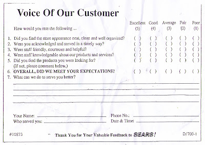
When Rensis Likert invented the Likert scale in 1932, he developed a balanced way to gather perceptual information from subjects. These surveys generally offered a statement and asked respondent to rank their agreement with the statement.

The original scale listed five possible responses from subjects. The responses were;
  • Strongly Agree
  • Agree
  • Neither Agree nor Disagree
  • Disagree
  • Strongly Disagree
This survey, from Sears, is actually pretty even. The middle value on the satisfaction scale is "Average". (Personally I tend to favour four-point or six-point scale as the respondents can't take the easy route and just rank things as "Average", they must be positive or negative.)

Too many of these customer surveys include scales that include a bias that makes the results at best unreliable. I commend Sears on providing a balance scale for their customers to use.

Labels: , , ,

Wednesday, May 30, 2012

Have a better day!

BCAA Logo   Source: http://rcfm.ca/wp-content/uploads/2011/05/BCAA.jpg
Last weekend I was in Kamloops to present at a workshop on Student Engagement at Thompson Rivers University. Two-thirds of the way there the temperature on the car's thermostat went into the red and stayed there. We slowed down to 60 KMPH on the climbs, coasted down the descents, and crawled into Kamloops with the four-way flashers blinking away.

As we are British Columbia Automobile Association (BCAA) members, I called BCAA to get a technician to come and have a look at the car.

The call centre I reached was in Burnaby, a Vancouver suburb.

The best part of the whole experience was the closing remark from the customer service person on the other end of the line. Instead of "Goodbye", "Have a nice day", or "Thank you for calling BCAA", his final remark was "Have a better day".

That sums up what I really wanted for the rest of my day. I just wanted things to get better. Makes me think that BCAA, and its staff, really understands what its customer's are going through.

And that is not really surprising, Close to 100% of BCAA employees drive, and probably know firsthand the frustrations that accompany a breakdown. Sometimes a "better day" is all that a driver can hope for.

Labels: , , , , ,

Thursday, May 17, 2012

How did I get on this mailing list?


I have no idea how I ended up on this mailing list. Apart from some foreign exchange transactions, I've never conducted any financial dealing with firms other than banks, brokerages, and trust companies.

And I'm not really in the market for "up to $5,000" and I thought that the rate would probably be about the same as those available for a cash advance against my credit card.

Well I was wrong. The rate is 3.89% per month, or 47.87% per annum. For a moment just consider that you can probably get a cash advance against your credit card for only 19% per annum and that the legal maximum interest rate in Canada is 60% per annum.

In the letter, the firm contrasts itself against the competition. "We are different than the big stuffy banks that often say "no" or the high cost payday loan companies". One of the suggested uses of a loan is to pay your "monthly rent".

If you are taking out a loan, at 47.87%, to pay the rent I have one suggestion, MOVE. This may be a great business model for easyfinancial, but for a consumer this is a potentially catastrophic proposition.

According to the firm's financial statements, the company's allowance for loan losses is 5.4%. While that is much higher than the provision for loan losses at a bank, the 47.87% interest charged by easy financial would seem to leave a HUGE cushion against loss.

So, while I see this letter for what it is, an offer of money I don't need at a rate I would never pay, I'm sure that there are many people who will take out a loan because they see no other way out of their current financial situation. Sounds a bit like Greece and the IMF.

Labels: , ,

This is a heathy snack?

Shoppers Drug Mart - shapers Snack Bar
shapers Packaging detail
Somehow, this product is part of a "healthy weight loss plan". According to the packaging, "As part of healthy eating, this food may be an asset in achieving and maintaining a healthy body weight because it's portion controlled".

So, one bar is only 30 grams, about 60% of the size of a regular chocolate bar, and therefore only 100 calories. So it is apparently a healthier snack than a chocolate bar.

But the first ingredient is "Polydextrose" and the second is "Chocolate Flavoured Coating". And the primary oils, Palm and Palm Kernel, are both "modified". In 30 grams of snack bar there are 4 grams of fat and 9 grams of sugar. 13% of the bar is fat, and 30% is sugar.

So, while the size and thus the caloric content of the snack may be healthy, the ingredients don't really say healthy to me.

And the entire "healthy" claim is really based on people controlling how much they eat. So, if I eat more than one bar, the whole "healthy" claim is shot. I think that "healthy" would be better achieved by eating inherently healthier foods, fruit etc., not by eating smaller quantities of rubbish like this over processed bar.

Labels: , , , , ,

Can you trademark a curl?

Cone wrapper for Dairy Queen softserve
A few days ago I made the mistake of taking my daughter to the mall to go to Safeway. She had wanted to get a hot chocolate, but as we walked by the Dairy Queen shop she changed her mind and decided that an ice cream cone was now the desired treat.

Now, the contents of a Dairy Queen cone can not really be defined as "ice cream", (it is described as "softserve" and has a much lower percentage of milk fat) but for my daughter anything cold and white in a cone must be ice cream.

Does my daughter even notice the "Curl on Top"? Does anyone else? Can you trademark the curl on top? Does it offer any protection? Would any other company selling softserve put a curl on the top of their cones? Could Dairy Queen do anything to prevent it?

It makes me wonder why a firm would pin their brand to something so ephemeral and reproducible.

Labels: , , ,

Is this the best, or worst, brand extension?

KISS Scratch & Win Lottery Ticket
When I saw this ticket yesterday I could not decide if it was the silliest, or smartest, brand extension that I'd ever seen. My initial reaction was that it was a bad idea. But then I stopped and thought about it.

Despite all of my other musical sins, I've never been a fan of KISS. With the exception of the sappy depths of Easy Listening and the annoying over-production of New Country, I'll listen to just about anything. But I never really got the point of KISS. The makeup and theatrics seemed to be making promises that the music could not keep.

However, KISS fans are loyal. When Paul Stanley played the Phantom in the LIVENT production of The Phantom of the Opera in Toronto, he breathed new life into ticket sales. People who would never think of going to musical theatre where lining up to buy tickets.

The demographics of the KISS audience are probably a pretty good fit with the average Scratch & Win ticket buyer. So, while I'm not a KISS fan, I'm also not a Scratch & Win ticket buyer. But plenty of people are both, and that is what keeps this sort of branding alive.

Makes we wonder what other bands might be a good fit for lottery tickets? And I also wonder who approached whom to sign this licensing deal?

Labels: , , , , , , ,

Tuesday, May 15, 2012

Coffee and Cycling. Is there a better match?

Musette Caffe - Between Burrard Street and Hornby Street in Vancouver
You have to love someone who has a vision and then sticks to it. And not only someone who has a vision, but also has the necessary creativity, persistence, and business sense to make it work.

Thomas Eleizegui is one such person. In a coffee-mad and bicycle-mad city he has found a great way to combine the two in a great little cafe. Fabulous coffee and the most bike-friendly space you'll ever find.

Inside, apart from the usual range of espresso-based beverages and tasty snacks, are a staggering array of cycling souvenirs. Photos, musettes, and even LEGO figurines, all speak to the cafe's concentration on meeting the needs of cyclists. Bike racks both inside and out, along with loaner locks make this a safe place to bring your ride.

And the colour? Inside and out a stunning tribute to the cycling heritage of a fine Italian brand, Bianchi. This sea foam green, known to Bianchi aficionados as "Celeste" is one of the most readily identified colours in cycling. And at Musette (http://www.musettecaffe.com/) not only is the building exterior painted in in "Celeste", so is the espresso machine.

So, while the cafe may be a bit hard to find, its brand image is unforgettable. Highly recommended.

PS What is a "musette"? I can't do any better than the description on the cafe's webiste. "Musette Bag: Small lightweight cotton shoulder bag, used for containing food and drink given to riders in a feed zone during a cycle race. The bag is designed so that it can be easily grabbed by a moving rider. The shoulder strap is placed over the head and one shoulder, the contents are then removed and placed into jersey pockets or bottles (bidons) are placed into bottle cages. The bag is then discarded."

Labels: , , , , , , , ,

Monday, May 14, 2012

More wasted B2B advertising

Transit shelter advertising in Vancouver
According to the company's website, "Incorporated in 1973, Action Data Communication Ltd. is one of Western Canada's leading technology contracting companies with expertise in all aspects of voice, data communications, wireless and electrical.
One of Action's core strengths is the ability to leverage a team of highly qualified field technicians, whose proven expertise ensures the completion of the most demanding projects. Offering a diverse portfolio of services, Action specializes in the design, deployment, optimization, management and maintenance of communication and digital security networks."

So why are they wasting their money advertising on a transit shelter? Transit shelters are best suited to B2C products and services with mass customer bases. Will a B2B customer really be swayed by an on a bus shelter? I highly doubt it.

Labels: , , , ,

Friday, May 11, 2012

Just a bit of amateur rebranding

TD Canada Trust branding inside a shopping complex elevator
I've banked with the TD (Toronto Dominion) Bankfor a long time. My mother used to bank with Canada Trust. (Their ATM machines were named "Johnnycash" and Mr. Cash did advertising for the firm.)

The two firms merged, well TD bought Canada Trust, and for now the branches are identified as TD Canada Trust.

Unless, of course, some vandal engages in a bit of amateur rebranding.

I wonder what would be worse; TD Canada  rust or TD Canada Truss? Either way, it does nothing to increase confidence. And if there is one thing that Canada banks tend to do well it is inspire confidence. They may be bastions of fiscal conservatism, but none of them has gone broke recently.

Labels: , , , , ,

Someone else who doesn't understand the rainbow

Rainbow bubblegum packaging
According to Sir Issac Newton a rainbow contains seven colours; Red-Orange-Yellow-Green-Blue-Indigo-Violet.

So, no Light Green, no Pink and no White. And it is not as if you can't find something that could logically be purple. How about grape bubblegum? And what is even sillier is that the little coloured circle after the "W" includes purple.

I know it is a small thing, but it does drive me crazy. (And I don't get into how some of the lettering colours match the gum really well (Yellow, Light Green, and Green) and some are horrible (Red and Blue).)

Labels: , , ,

Further proof that newspapers are dying

Recycling bins in Vancouver, BC
These recycling bins are behind my apartment. The bin on the left is for containers. (Bottle and cans). The one on the right is for newspapers. And the three in the middle are for mixed paper.

The bins get emptied on Fridays and yesterday morning the three mixed paper bins were filled to overflowing, while the newspaper bin was less than 1/4 full.

The mixed paper bins are filled with shoe boxes, shopping bags, and all manner of packaging materials. So, it would appear that consumers are buying everything in sight, but paying little or no attention to newspaper advertising.

Labels: , , ,

Thursday, May 10, 2012

"Got" everything?


"got milk?" ad with Steve Nash


The "got milk?" campaign was created for the California Milk Processor Board in 1993. The intent of the campaign was to increase sales of milk, and although from 1995 on advertisements based on the concept ran nationwide in the USA, the biggest increase in sales was in California.

Since its creation almost 20 years ago, the campaign has become one of the most imitated and parodied ever. The "GOT CRAFT?" postcard is just one of the most recent examples.

Although the campaign only ran in the USA, it is somewhat remarkable that the knockoffs and parodies can be found all over the world. But then isn't imitation the sincerest form of flattery?

Labels: , , ,

Wednesday, May 2, 2012

How quiet is a library?

Future Shop Flier - April 27 to May 3, 2012

Future Shop Flier (Detail) - April 27 to May 3, 2012
Future Shop Flier (Detail of Text) - April 27 to May 3, 2012
Have you been in a library recently? They are no longer the quiet refuges of my childhood. Librarian no longer spend all of their time going "SHHHHH" to people spekaing above a whisper.

Today libraries are filled with computers and toys, children are playing, teens are getting tutored, and patrons are asking the librarians for help with everything from email to ebooks.

But for come marketing person, the image of a library as a place of quiet was still strong enough to use as a descriptor of the noise level of this product from Sharp. I wonder how many potential customers will make the connection? And how long will this connection be valid for consumers?

Labels: , , ,