Bad design or bad installation?
 |
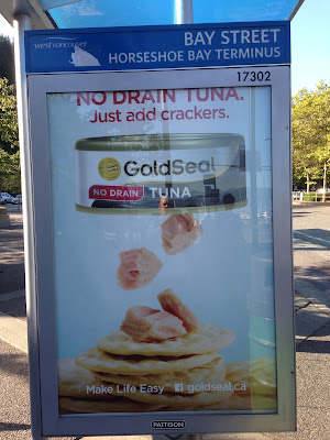
| Gold Seal Tuna advertisement on transit shelter, Horseshoe Bay ferry terminal, West Vancouver, BC |
The text at the top of the frame should not be cut off. Either the designer didn't know the viewable area of the frame, or the people from Pattison installed this sign the wrong way.
But it doesn't really matter whose fault it is, this advertisement fails the readability test. And if the consumer can't read it, then they won't pay attention.
Labels: advertising, out-of-home advertising, public transit, transit advertising, transit shelter

0 Comments:
Post a Comment
Subscribe to Post Comments [Atom]
<< Home